


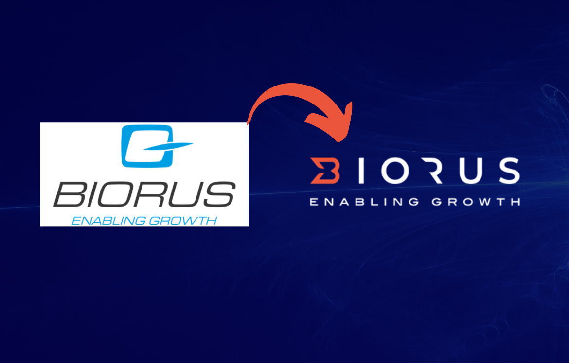
Rebranding a Company Logo: BIORUS Level Up!
When a company decides to rebrand its logo, it is usually for a good reason. We here at BIORUS believe that our professional profile had grown and evolved throughout 2020 and 2021, and that starting January 2022, it was time to adapt. We have transformed our logo to reflect who we are today and to symbolize our adaptation to award the future. After conducting a lot of research, our creative marketing team have completed the new logo design to include wings, arrows, and a heart. We believe that this logo includes the key elements that convey our mission and dedication for enabling the growth of our clients and business partners
The wings in our new logo are a tribute to our engineers, who we consider our personal superheroes. They work hard to make sure our services are the best they can be, thus also making the wings a symbol of their hard work and dedication.
The arrows represent our fast action; we pride ourselves on our two-hour response time. In this way, we are honoring our technical teams’ hard work and dedication by recognizing that they help us provide the best customer service possible.
Finally, the heart symbolizes our love for what we do and the people we serve. Offering world-class technology to the healthcare industry and the community is our passion, making the heart a reminder that our work is driven by compassion and dedication, not by profit.
Our new logo is a perfect way to honor our engineers, the people we serve, and our dedication to providing excellent products and services. We are proud of our new logo and look forward to continuing to serve the healthcare industry and the community with our world-class technology.